Hi! Welcome to my A level media blog. My name is Molly Sullivan (0816).
I'm in Group 4 with Maisie MacGregor (0506), Mari Leach (0440), and Ellie Brackpool (0100)
You can navigate my blog by using the column on the right hand side where you will find the following labels:
A2 Prelim, A2 Research and Planning, A2 Production and also a link to all of the work I did for AS.
There's also a link to the Latymer music video blog as well as a live link to the group's Facebook group.
Click here to access the group's Facebook page.
Thank you and I hope you enjoy my blog!
Our Music Video
Digipack

Front and back cover of the album.
Digipack

Inside covers of the album
Monday, 26 January 2015
Friday, 2 January 2015
1) In What Ways Does Your Media Product Use, Develop, or Challenge Forms and Conventions of Real Media Products?
For this project, my group and I created a British, dance/pop music artist called Lucid City, made up of two male DJs and one female lead vocalist. We were heavily inspired by artists such as Disclosure, Clean Bandit, and Ellie Goulding. We produced a music video for their debut single, 'My Head is a Jungle;' we both used and challenged conventions and stereotypes in our music video. Our video was loosely based around a simple narrative with a clear beginning, middle, and end which was very conceptual; it also contained performance sections which ran throughout the video.
Conventions of the dance music genre:
Our own music video relates a lot to Andrew Goodwin's theory on music videos in 'Dancing in the Distraction Factory.'
Our music video definitely demonstrates some typical characteristics of its genre; this was because we watched a multitude of music videos that belonged to the dance and pop genre and looked at what they all had in common.
When looking at the mise-en-scene of dance music videos we noticed that many of them featured scenes set in a club, or in a party-like atmosphere; often based around crowds of people dancing or having fun. It's common among dance music videos to show clips of crowds of people at festivals where the DJs played a live set, this really creates an exciting and energetic vibe to the video, which is something we wanted to replicate as best we could in our own video. Although, to replicate these types of scenes exactly would be very difficult, as we do not have access to a huge festival stage with thousands of screaming fans - but instead we focused on the feelings that are portrayed in those scenes, and tried to recreate those emotions.
This video shows clips from the balloon shoot in which we got our cast members to dance the most out of the several different set ups.
Large crowds - our music video challenged this
 |
| Swedish House Mafia - Don't You Worry Child |
Inside clubs - our video challenged this
 |
| Katy B - Broken Record |
I made these three gifs from the music videos of three different popular dance songs by Route 94, Zhu, and Katy B. All three of these videos follow dance genre conventions as they features scenes which are set in a club, with lots of dancing as well. Although they follow the same conventions, they are all visually very different, which is what we hope our video will be too.
Contrast between inside clubs and outdoors festivals
The music video for 9TS Baby by Redlight includes clips taken from their live shows, in dark, crowded clubs as well as more festival-like shows where the crowd of people are all outside, having fun in a more chilled out and light atmosphere.
 |
| Redlight - 9TS Baby |
Shots like this would be hard to replicate in some aspects as the lighting plays a really big part in the effect of the scene. We don't have access to strobe lighting and flashing lights like the ones used in this video so we have chosen to not set any of the video in a club.
The music video for Disclosure's 'F For You' is a good example of a performance-driven dance music video based around two DJs. I have made some comparisons between some stills I took from their video, and from our own video.
 |
| Disclosure 'F For You' beside our own music video |
Both music videos include mid-close up shots of the DJs individually, this introduces them as the artist, as well as the singer on the track.
 |
| Disclosure 'F For You' beside our own music video |
We tried to maintain symmetry between the two DJs in our wide shots. However, ours is different to the wide shots of Disclosure as we have included our female vocalist in between the two DJs.
 |
| Disclosure 'F For You' beside our own music video |
 |
| Disclosure 'F For You' beside our own music video |
Similar to Disclosure's video, we wanted shots of the DJs where they're not performing to the camera.
Narrative:
Simon Frith suggested that all music videos fall into one of three different categories: narrative, concept, or performance. Our video has taken elements from both the narrative and the performance categories as we have a loose narrative, a beginning, a middle, and an end, as well as performance scenes.
The narrative in our video loosely follows Todorov's theory - beginning with an equilibrium, meeting a disruption, and then reaching a new equilibrium at the end.
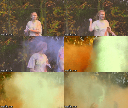
Disjuncture is a technique that is often used and applied by indie bands in attempt to demonstrate their originality, making their video different to many others.
 |
| "In a dark room, we fight," |
 |
| "Our shadows will dance." |
Relationship between music and visuals
Andrew Goodwin's theory of music video also suggests that there is a relationship not only between the lyrics and the visuals, but also between the music and the visuals. This relationship is definitely visible within our music video, and is often of an amplifying nature.
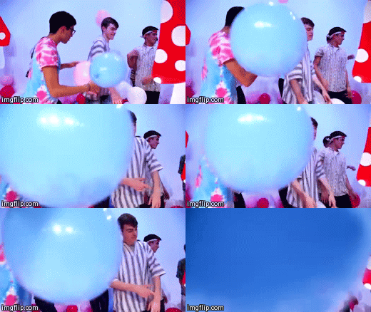 |
| The balloon hits the screen three times, each time the cymbal sounds in the song |
 |
| As the music slows down, the scene with the pinata is slowed down into slow motion to match the pace of the song |
 |
| As the pace of the song speeds up, so does the pace of the video we did this by making quicker and shorter cuts between different shots |
 |
| Katy B, Aluna (Aluna George), Ellie Goulding, Georgie (from our own video) |
Intertextuality
Music videos are a great example of texts that are often full of intertextual references that usually refer to popular culture that the audience will recognise and connect with. I made the video below to demonstrate several different examples from various music videos that include intertextual references.
Intertextuality was a major part of our video; we decided that we wanted to use Alice in Wonderland as our focal reference throughout the video. The Alice in Wonderland influence on our video is most clear through the narrative and the set design. We thought that Alice in Wonderland was a good choice as most of our target audience (16-24 year old males and females) would have watched the Disney cartoon film as a child; so perhaps the video would add a sense of nostalgia to our target audience which would increase the appeal of the music video to them.
In 'The Kindest Cut - Functions and Meanings of Music Video Editing' Carol Vernallis explores her theory behind music videos. When talking about the narrative of music video, she says that the structure of the video may be disjointed; this applies to our music video as we often cut between the different scenes and set ups, like cutting between the balloon scene and then the paint fight scene.
In terms of editing, our music video does relate to Vernallis' theory when she says that:
- editing may match the musical phrases or the beat
This applies to our video as when it came to editing, we cut to the beat; keeping the video fast paced to match the song. There is a section towards the end of the video where the song really speeds up and so to match the video with the music, we did much quicker cuts between different scenes. I think this method of editing worked really well in our video, it adds excitement to the video, engaging the audience.
 |
| Fast paced editing. |
Colour Scheme
Whilst looking at music videos of the dance genre we noticed that there was a strong recurring colour scheme that ran throughout many of the videos that we were inspired by. In the grid below are screenshots I have taken from a handful of different music videos of the same genre as our music video. It became noticeable that pinks, blues, and purples were present in a lot of the videos. These colours really stood out for us, and we wanted to use these colours as part of our own colour scheme.
As pink is stereotypically seen as feminine colour, and blue is stereotypically associated with males, we thought that using both colours was a good representation of our artist that is formed of two males and one female.
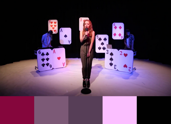
The three pictures below show stills from the performance scene, and the balloon scene of our music with the colour palettes taken from that still. The colour palettes demonstrate how we stuck to our original colour scheme ideas of pinks, purples, and blues.
Website
I looked at Chase and Status' website and made some comparisons between their site and ours. I chose to look at Chase and Status as they are a great example of a dance group, of two male DJs, who have gone on to reach mainstream success.
Banner/Menu Bar
We found that most effective websites feature a banner at the top of the page which displays the menu bar; this makes the website simple to navigate around. Chase and Status used a wide photo on their banner which we chose not to do as our website home page features a slide show of pictures under the menu bar. However, their banner did also feature their group Logo in white to make it stand out. We knew that having am eye-catching logo was essential especially for a new group, so we used this as our website banner.
 |
| Chase and Status website banner |
 |
| Lucid City website banner |
Social Media Icons
 |
| Chase and Status social media icons |
Chase and Status' website features social media icons at the header and the footer of their website, similar to ours. They used their black/orange/white colour scheme for their icons and we kept to black and white icons for ours to make them clear.
 |
| Lucid City social media icons |
 |
| Chase and Status' news page |
Almost all of the artist websites we looked at had a news page which they used to inform the fans of any news regarding the band. This means that the fans can keep up to date with what the band are doing; it provides the fans with a sense that they are closer to the band. On our page we included news items such as; videos, competitions, new music releases, and festival announcements. We included a feature on our news page that allowed the user to enter the email address to sign up to the band's newsletter.
 |
| Lucid City's news page |
About
 Lots of artist's have an 'about' page on their website which gives the consumer a brief description of the artist. Some websites feature small, personal, witty biographies about each member; whereas other artists have a brief overview of the history of the artist. As our artist is very new, we thought it was important to let the website visitor know a little bit of information about each member. We kept the biographies short and sweet, showing that the members do not take themselves too seriously, creating a fun atmosphere around the group. It was essential that we put across the personality and character of each member so that the fans can get to know the members too.
Photo Gallery
Every artist website that we looked at had a page dedicated to photos of the artist, and so we followed this convention. We noticed that another convention for artists of the dance genre, was to have photos of their live sets, at festivals and concerts. However, as we are a new artist this was not possible for us to do, so we included a 'behind the scenes' photo gallery, full of pictures of the artist during shoots, and having fun in general.
Live Music / Gigs
A crucial component of an artist's website is their tour page; this is a page dedicated to informing the consumer about any upcoming shows the artist will be playing. On our website we included a column on the right side of the page which showed each individual date of the tour, and which venues Lucid City were playing at around the UK. This also provided the fan with a 'buy tickets' button which would link them to a site where they could purchase tickets to their chosen tour date. As well as the UK tour column we dedicated a large section of the page to summer festival shows; these shows are not part of the UK tour as many artists finish their tours before summer starts, in time to perform at all the biggest festivals. We chose festivals and events that are especially linked to dance music so they were most appropriate for Lucid City to perform at. We gave such a large portion of this page to summer festivals as these are the type of events that our target audiences will most likely be attending.
Having an online store is a common feature of any music artist, including those of the dance music genre. In Chase and Status' store they not only sold standard merchandise, but also products which would be considered at the higher end of artist merchandise; this includes £95 limited edition pendants. Products like this would not be suitable for our artist as it is highly unlikely that someone would pay that much money towards a product from a brand new artist. We focused much of our store products around the artist logo, keeping the synergy with the branding. We made products which would be well suited to our target audience so we produced products such as phone cases, backpacks, and beanies - items which would particularly appeal to the 16-24 year old demographic. We wanted to appeal to our primary and secondary audience equally so we made a male-tailored short and a shirt which was more suited to women, using different colours on each.
Contact
The purpose of a contact page is rather straight forward - it is there to provide a source where anyone can send a message to the artist, wether it is a piece of fan mail, or a business-like enquiry. Contact pages are usually the last page on the menu bar and often they do not contain lots of graphics, keeping the page very simplistic and focused on its function. We stuck to this convention, but we also included a Google maps feature which made the page more visual, and allowed the user to see where our record company offices were.
Digi-Pak
The purpose of the digi-pak is to sell the artist's music, this is why it is such an important artefact during the construction of our artist. Below, is a padlet which shows some of the album covers of other dance/pop artists that we looked at during the research and planning stage of our project. These albums covers inspired us and gave us ideas towards the design of our own album art.
 |
| Album cover. |
 |
| Disclosure's album back cover. |
It was important that we followed industry requirements and conventions on the back of our album cover. We included a barcode, institution logos, artist website, and copyright information.
We noticed that for many dance artists it was a convention to have a very minimal back cover that featured only the track names, usually sticking to the colour scheme on the front cover. We adhered to this convention and used a paint effect to keep in synergy with the other products.
 |
| Lucid City's album back cover. |
Overall, I think that across our three products, the music video, the website, and the digi-pak, we have not only used and developed, but also challenged forms and conventions of real dance music products. We knew that we had to stick to some conventions in order to be recognised as a dance artist alongside other artists in the genre. At the same time we wanted our artist to stand out, maintaining a unique artist identity which is why we challenged other genre conventions.
Thursday, 1 January 2015
2) How effective is the combination of your main product and ancillary texts?
In creating our three products; the music video, the digi-pack, and the website, we had to consider the importance of synergy across the campaign as this is crucial to the success of a new artist. Having an integrated campaign is not only important for the promotion of the artist but also to ensure consistency of the brand's message across the three texts. I think that we managed to achieve this by consistently maintaining a specific style across the different artefacts through brand establishment with techniques such as iconography, and by using a memorable logo. For this question, I will be referencing real artists such as Clean Bandit, and Disclosure who have had successful synergistic campaigns in the past.
Branding
Powder Paint
 Whilst on set of one of the powder paint shoots we took some pictures that we thought we might need to use at a later date, on our website or perhaps on our album cover. In the research and planning stage of the project we decided that we wanted to take a photo of the group of friends from behind, whilst they were covered in powder paint. This was inspired by the back cover of an MGMT album called Oracular Spectacular. Although our ideas for the album art changed during the process, we thought this image that we had taken was really strong so we decided to use it as the background image on the website's landing page. This means that it would be one of the very first images that any visitor to the website would see.
 We also made a video of lots of clips of footage that we had taken on the days when we were filming the powder paint scenes; this is another thing that the audience can watch on the website, hopefully keeping them there for longer.
Like many other real dance music artists, we wanted ours to perform at festivals in the UK and abroad. Festival culture is so important to our target audiences of 16-24 year olds, and is often the focal point of their summer. Lots of people in this demographic will have fond memories from music festivals and will be keen to attend more. On our website we include news on which festivals Lucid City will be performing at; we specifically chose festivals that often feature dance music artists.
 We wanted to maintain this festival vibe throughout our music video, to do this we created a fun atmosphere with the powder paint and the balloons. We asked all of our extras to where festival-like clothes; items such as tie-dye tops, trainers, patterned shirts, and bandanas.
We knew that it was important to not only maintain synergy across our campaign, but also to create symbiosis between other institutions. The board below highlights the different ways in which we have created symbiotic relationships with institutions such as clubs and radio stations.
We used our Facebook page in a similar way to the Twitter page; on both pages we used the album cover as our profile picture to create synergy between the different platforms, it also reinforces the imagery and makes the consumer more familiar with the album cover, making them more inclined to purchase it. Our Facebook page also contains links to the website and our other social media sites.
Branding
Powder Paint
 Whilst on set of one of the powder paint shoots we took some pictures that we thought we might need to use at a later date, on our website or perhaps on our album cover. In the research and planning stage of the project we decided that we wanted to take a photo of the group of friends from behind, whilst they were covered in powder paint. This was inspired by the back cover of an MGMT album called Oracular Spectacular. Although our ideas for the album art changed during the process, we thought this image that we had taken was really strong so we decided to use it as the background image on the website's landing page. This means that it would be one of the very first images that any visitor to the website would see.
The band's logo is also made out of powder paint, and this features on the header of our website, not only on the home page, but on every other page as well, to ensure that the logo becomes a really familiar icon amongst fans of the band. We wanted the logo to look as authentic as possible, so instead of using images online we photographed some of the powder paint that we had left over from one of the shoots and edited it during photoshop to add layers of the powder paint on top of each other to make a bolder image.
 We also made a video of lots of clips of footage that we had taken on the days when we were filming the powder paint scenes; this is another thing that the audience can watch on the website, hopefully keeping them there for longer.
On the website we had a section for 'behind the scenes' pictures which had a large selection of pictures to look at, many of which featured powder paint, further maintaining the powder paint theme through the website.
Our powder paint logo is also present in our icon on our Soundcloud account which will be seen by those who choose to listen to our music via Soundcloud rather than on other online sites such as YouTube. As Soundcloud is used a lot by fans of the dance genre, we thought it was important to create an account to target our primary audience; it is a website which is focused on the music and so it doesn't have many visuals, this is why it was so important to have our bold logo as our icon to keep up the synergy.
The powder paint logo is also the main feature to our artist's merchandise, on clothing such as our women's baseball shirt and on accessories such as an iPhone 5 case.
Another dance artist who now has a very recognisable logo is Disclosure; they use the same stylised image of the outline of a face throughout their different products. They use in their music videos, album covers, promo shots, on merchandise, and all throughout their campaigns - they even projected it onto buildings across the world, including London's very own Big Ben.
Clean Bandit are a real dance music artist that shares lots of similarities with our own artist; they are young, fairly new, British, they have both male and female members, and art of the same genre as our artist Lucid City. I did a small case study on their marketing campaign whilst we were creating our own, I focused on the synergistic aspect of their campaign. The mind map below explores some of they key things I discovered while looking across some of their different campaigns.
Festival Iconography
As well as using powder paint, we wanted to create a festival-like feel to our artist's products, making their brand fun and youthful in order to appeal to our target audiences. We created a competition page on the website which asked fans to send in their best festival photos for a chance to win festival tickets to see Lucid City in the summer of 2015. We included a 'latest entries' slideshow feature to the page; we included lots of my own photos from a festival I attended last summer to further portray this festival vibe.
 |
| The competition page on our website. |
We included a section on the 'news' page of our website which provided the fan with a link to the competition page, we also encouraged fans to enter the competition by sending us their photos via our Twitter page, creating synergy between our official website and our social media sites.
 |
| Competition news. |
Like many other real dance music artists, we wanted ours to perform at festivals in the UK and abroad. Festival culture is so important to our target audiences of 16-24 year olds, and is often the focal point of their summer. Lots of people in this demographic will have fond memories from music festivals and will be keen to attend more. On our website we include news on which festivals Lucid City will be performing at; we specifically chose festivals that often feature dance music artists.
 |
| Lovebox festival. |
 |
| Wireless festival. |
 We wanted to maintain this festival vibe throughout our music video, to do this we created a fun atmosphere with the powder paint and the balloons. We asked all of our extras to where festival-like clothes; items such as tie-dye tops, trainers, patterned shirts, and bandanas.
 We knew that it was important to not only maintain synergy across our campaign, but also to create symbiosis between other institutions. The board below highlights the different ways in which we have created symbiotic relationships with institutions such as clubs and radio stations.
Blurring Effects
We used 'blurring' effects across our main product and our ancillary products. On the front cover of our album we used photoshop to lay several layers of the same image on top of each other to create a blurred effect. I think this looks really effective as album art as it is simple but not basic. We used this blurred effect in our music video as well; we wanted to use an interesting effect when Namoi transitioned into the paint fight scene.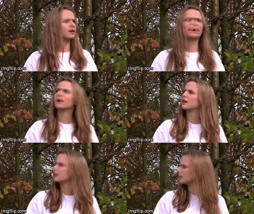

We used social media as our main method of marketing our products; we thought that this would be the most effective way of reaching our primary and secondary target audiences of 16-24 year olds. The graph below shows just how popular Twitter is amongst 15-25 year olds, 75% of Twitter users, of which there are millions, are from that age demographic.
 |
| A graph showing the age distribution on Twitter. |
On our Twitter page we wrote tweets that shared our music video, the 'retweet' feature on Twitter allows people from all different demographics, not just our target audience, to see our music video on their Twitter timeline. By watching the music video hopefully people will be encouraged to buy the album, or go onto the artist's website to learn more about Lucid City.
According to Richard Dyer's star theory, it is vital for the fans to believe that the artist's identity is authentic in order for the audience to connect with the artist which will encourage them to buy the product which will in turn, maximise the profits they make.
We used our Facebook page in a similar way to the Twitter page; on both pages we used the album cover as our profile picture to create synergy between the different platforms, it also reinforces the imagery and makes the consumer more familiar with the album cover, making them more inclined to purchase it. Our Facebook page also contains links to the website and our other social media sites.
We used our website to tie all the texts together, one of the main functions of the website was to sell the music - Lucid City's debut album. The album cover was featured a lot on our website, we provided many different purchasing opportunities for the consumer on the website. Not only could the site visitor purchase a physical copy of the album in a CD format and vinyl format, but they could also download digital copies of the album through iTunes. The collage above is made up from pictures of all of the different ways in which the album could be bought on the website.
Overall, I think that we created a strong brand across our main product and both of our ancillary texts, we used synergistic links between the different artefacts to maintain a consistent brand image for Lucid City. We also chose marketing strategies that would be best suited to reaching our target audiences, which helped us to create an effective marketing campaign.
Subscribe to:
Posts (Atom)


